


Reimagining DewesoftX's first impression
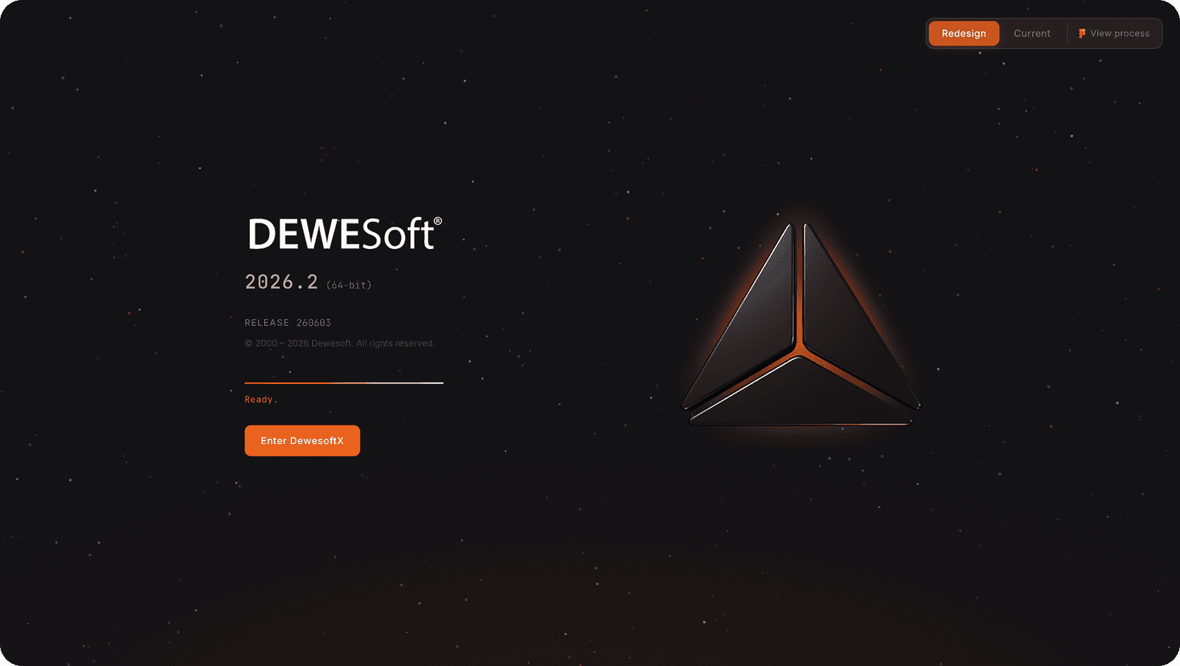
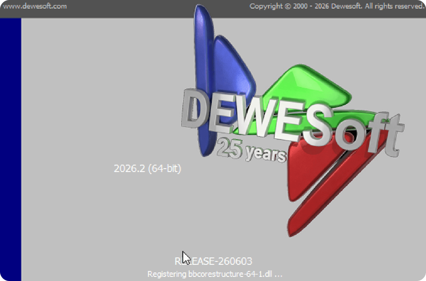
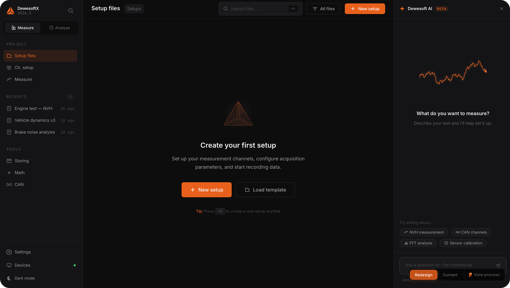
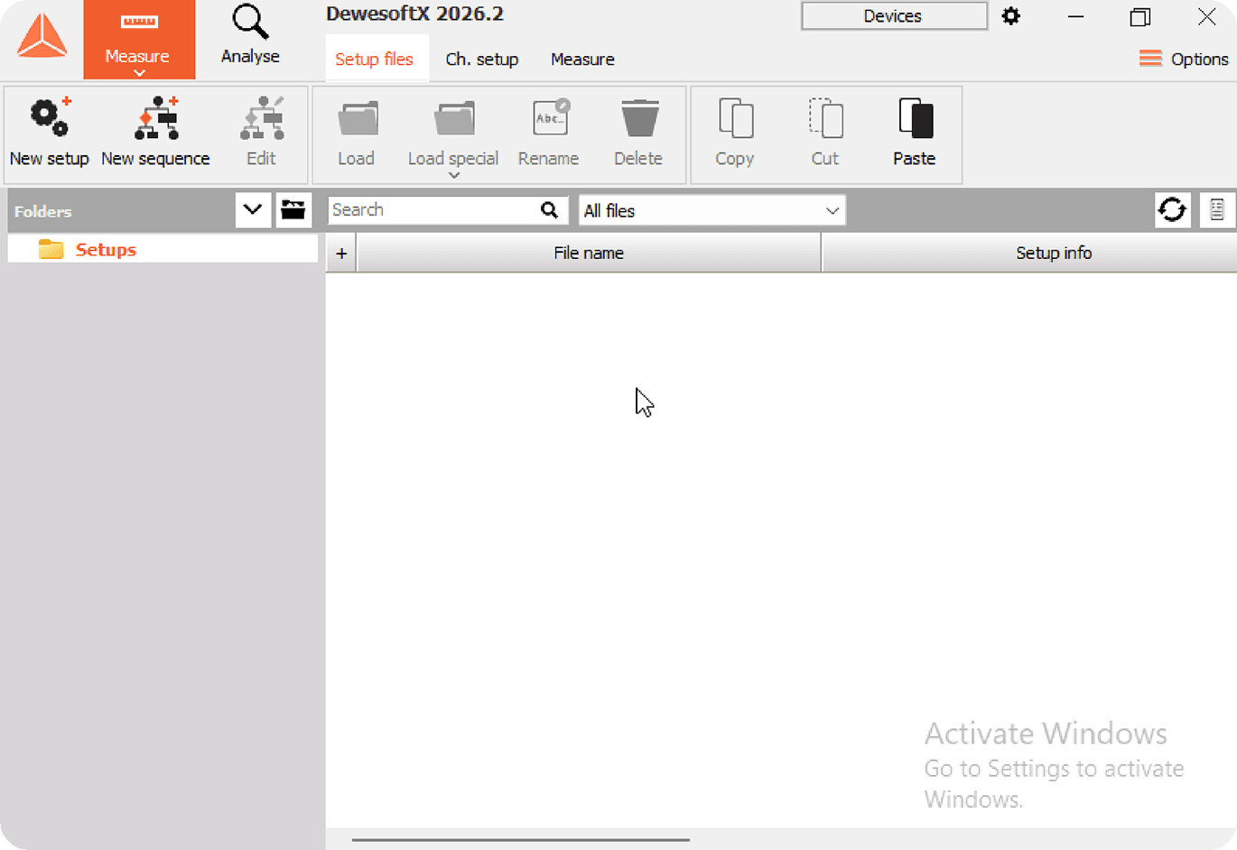
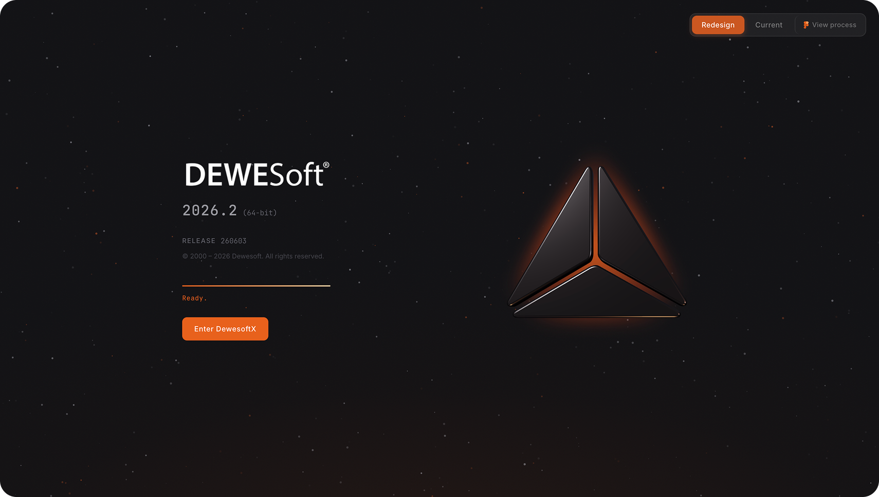
Dewesoft builds some of the most precise data acquisition hardware in the world — trusted by NASA, Tesla, and BMW. As a designer drawn to complex technical products, I set myself a personal challenge: explore how the software's onboarding experience could better reflect the premium craftsmanship of the hardware. This design exploration reimagines the DewesoftX splash screen and home screen.
The opportunity
Hardware excellence deserves a matching software experience
Dewesoft is a €100M+ employee-owned company with 400+ employees, serving the world's top engineering teams across automotive, aerospace, and energy. Their hardware — SIRIUS, KRYPTON, IOLITE — sets the industry standard for precision and build quality.
DewesoftX, their flagship software, is incredibly powerful with 35+ display widgets and advanced analysis capabilities. I saw an opportunity to bring the same level of craft to the software's first touchpoint: the loading screen and home screen that greet users every session.
Interactive prototype
Try the redesigned onboarding flow
Explore the prototype below. Each screen includes a toggle to compare the redesign with the current design, and a link to the full design process in Figma.
Design process
From research to prototype
The design process started with analysing Dewesoft's brand identity guidelines, existing UI patterns, and their product ecosystem. Explore the full design file below to see wireframes, explorations, and design decisions.