


Redesigning Intruder's navigation user experience
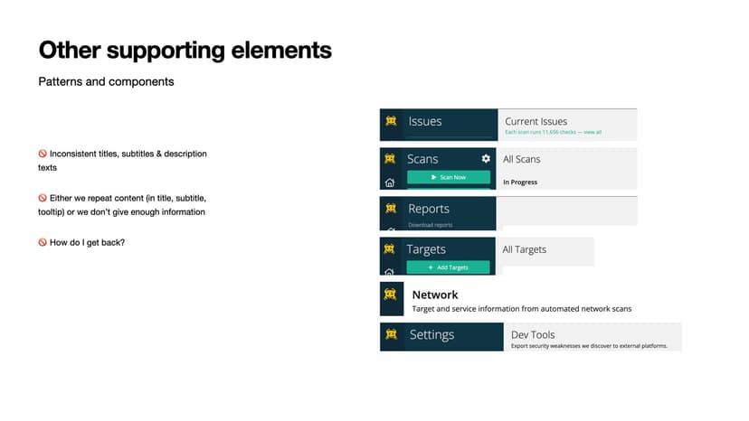
When I joined Intruder, navigation was one of the most pressing challenges. Users were abandoning tasks, support tickets were flooding in with confusion reports, and G2 reviews consistently mentioned our "uninviting UI" and "confusing interface." The navigation that seemed logical internally was creating real barriers for users trying to manage their cybersecurity scans.
What started as a usability concern had become a business problem — trial users weren't converting because they couldn't confidently navigate the platform. As one user put it: "I got anxious... I don't know how to go back." This wasn't about aesthetics — it was about trust and conversion.
The strategic challenge
When navigation becomes a barrier
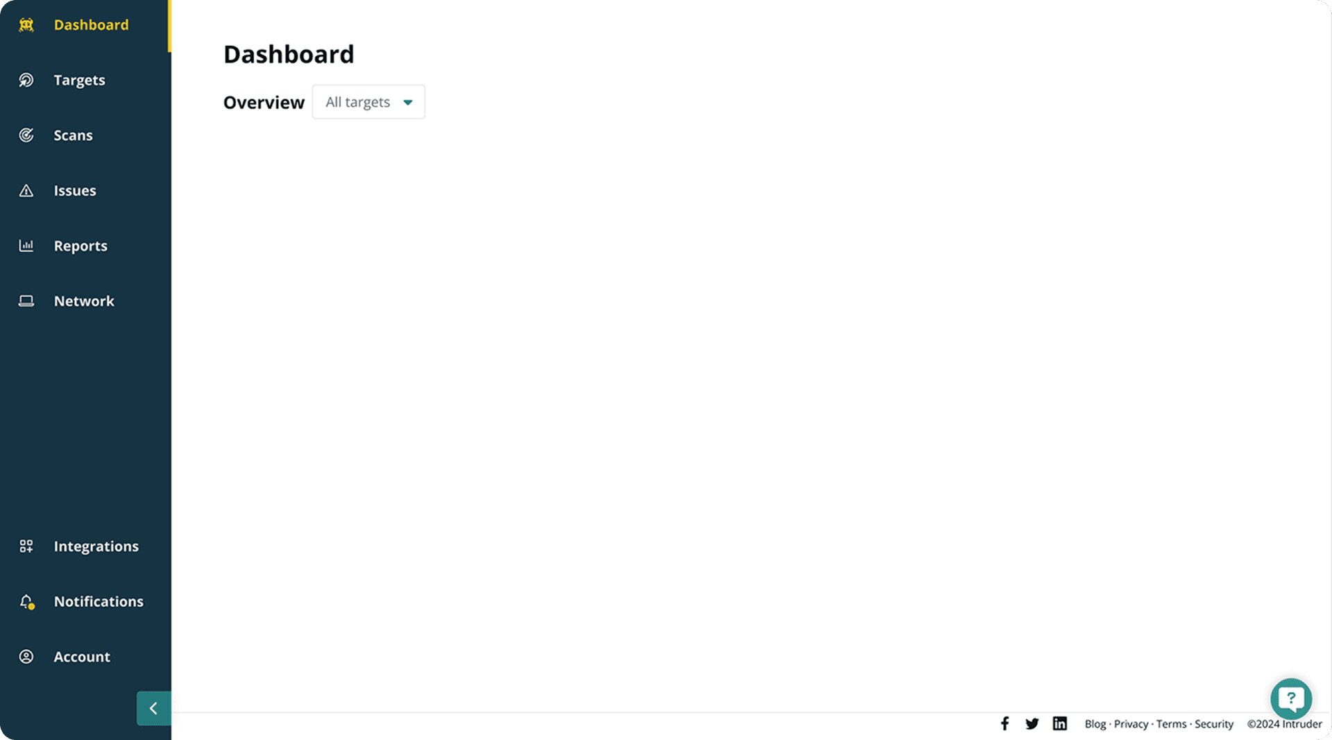
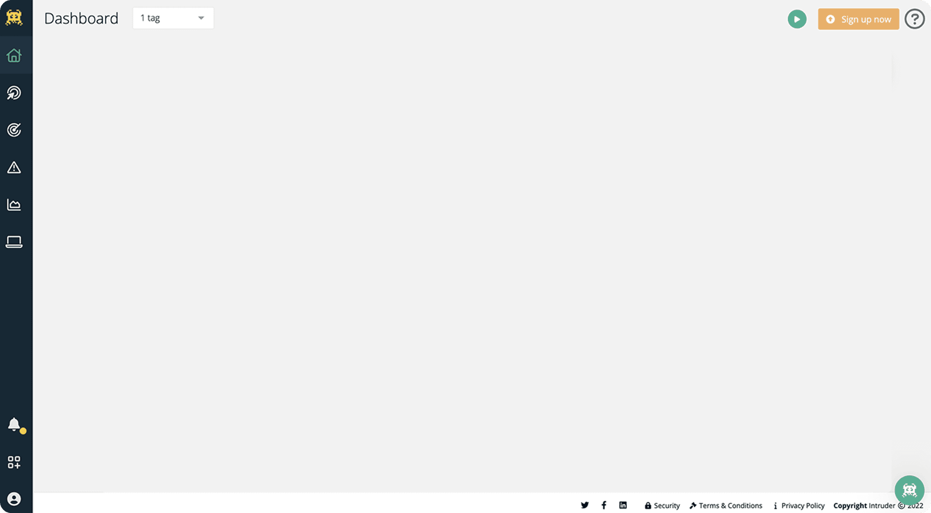
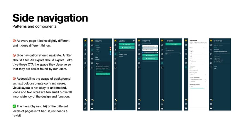
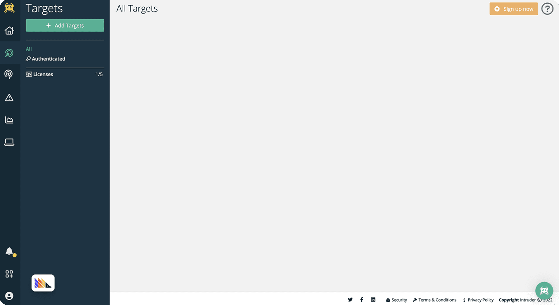
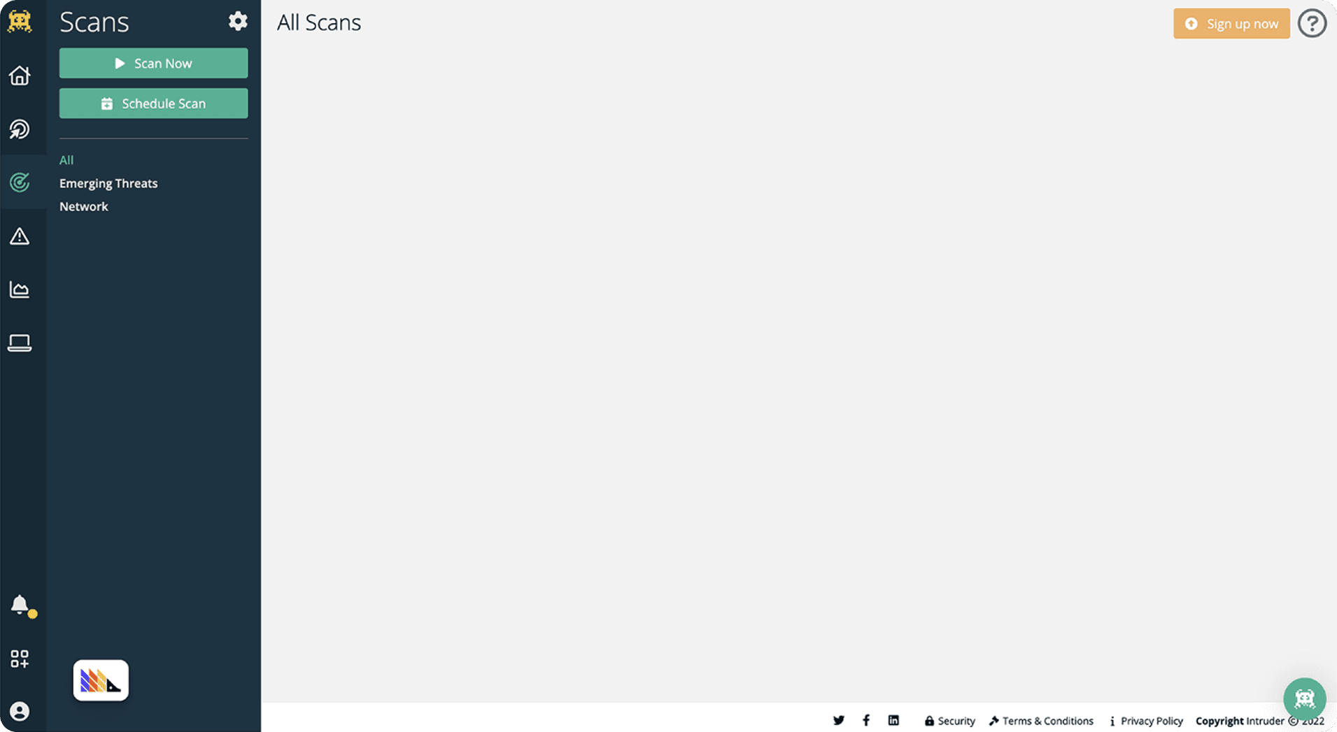
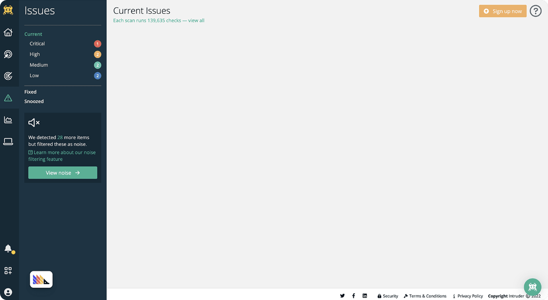
The problems revealed themselves quickly through user research. Our platform used a unique left-left-top navigation pattern that violated every industry standard our users had learned from other tools. While we thought we were being innovative, we were actually creating cognitive burden.
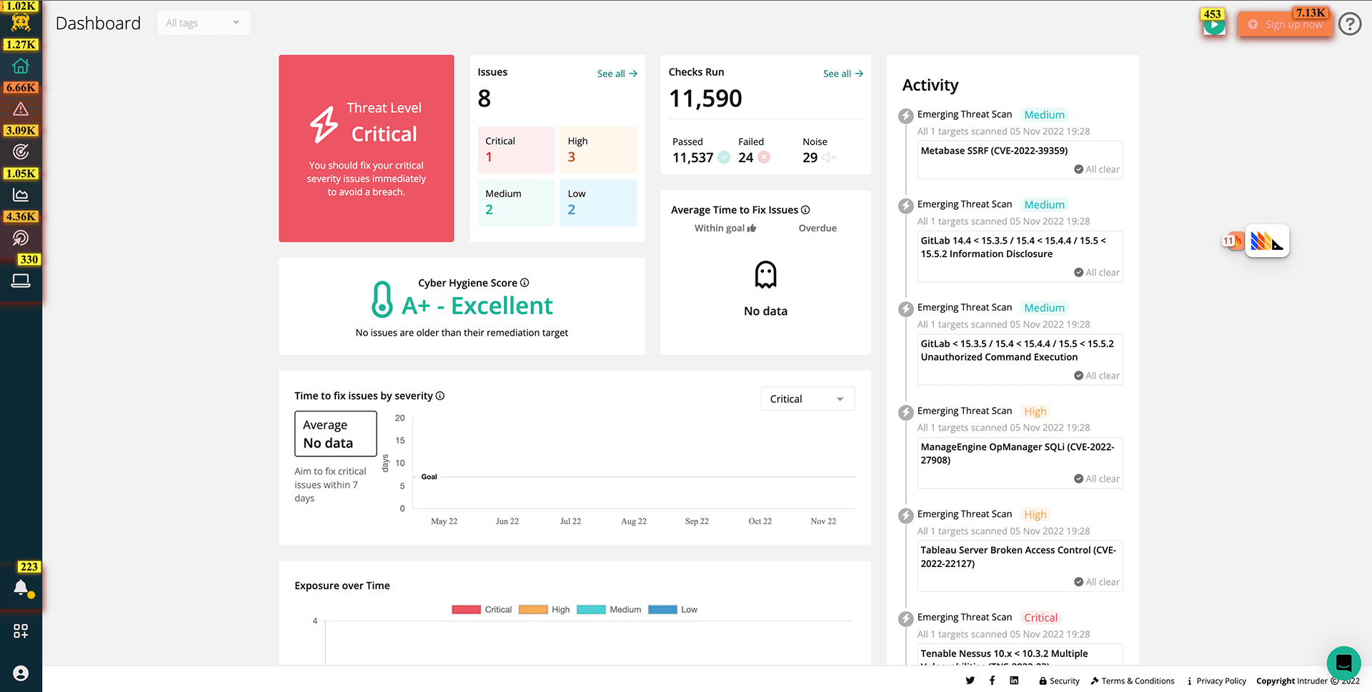
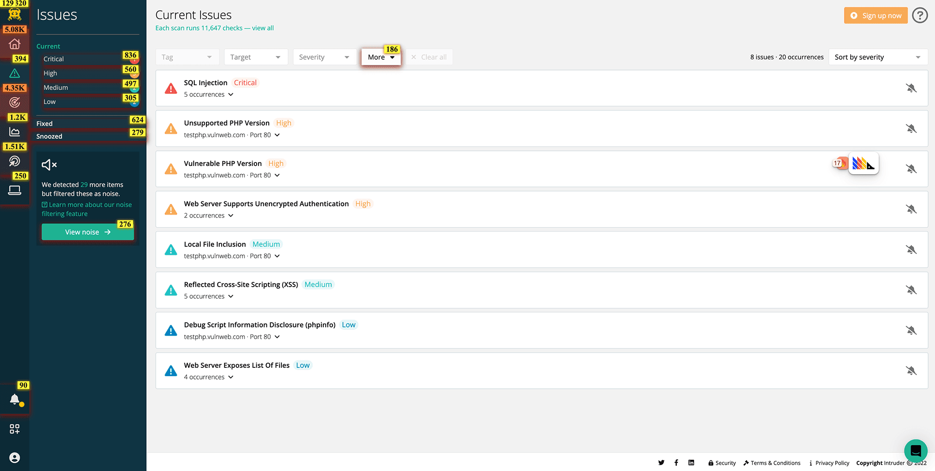
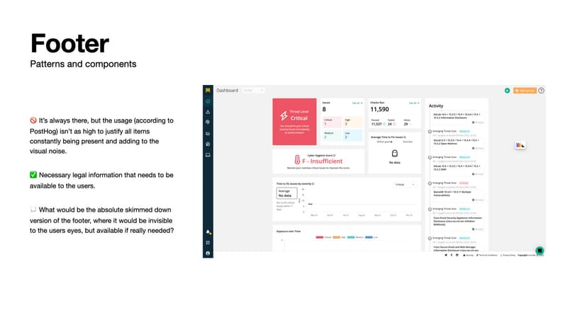
The data painted a clear picture. PostHog heatmaps showed users repeatedly clicking on elements that didn't behave as expected. Support tickets revealed that 23% of user issues stemmed from navigation confusion. But the most telling evidence came from our G2 reviews: "The interface can be a little confusing to start with, but after a little getting used to it, you can find what you need."
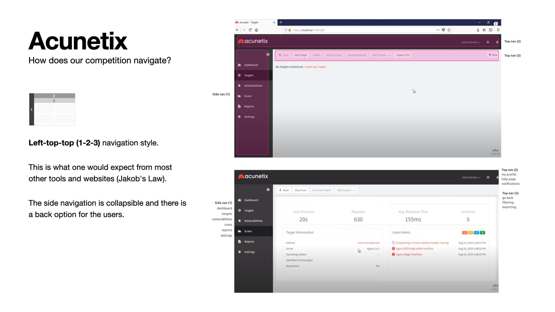
I knew we needed to understand not just what was broken, but why users expected something different. This led me to conduct comprehensive competitor analysis across six major cybersecurity platforms: Acunetix, Qualys, Nessus, Rapid7, Detectify, and Pentest Tools.
Research
Understanding the landscape
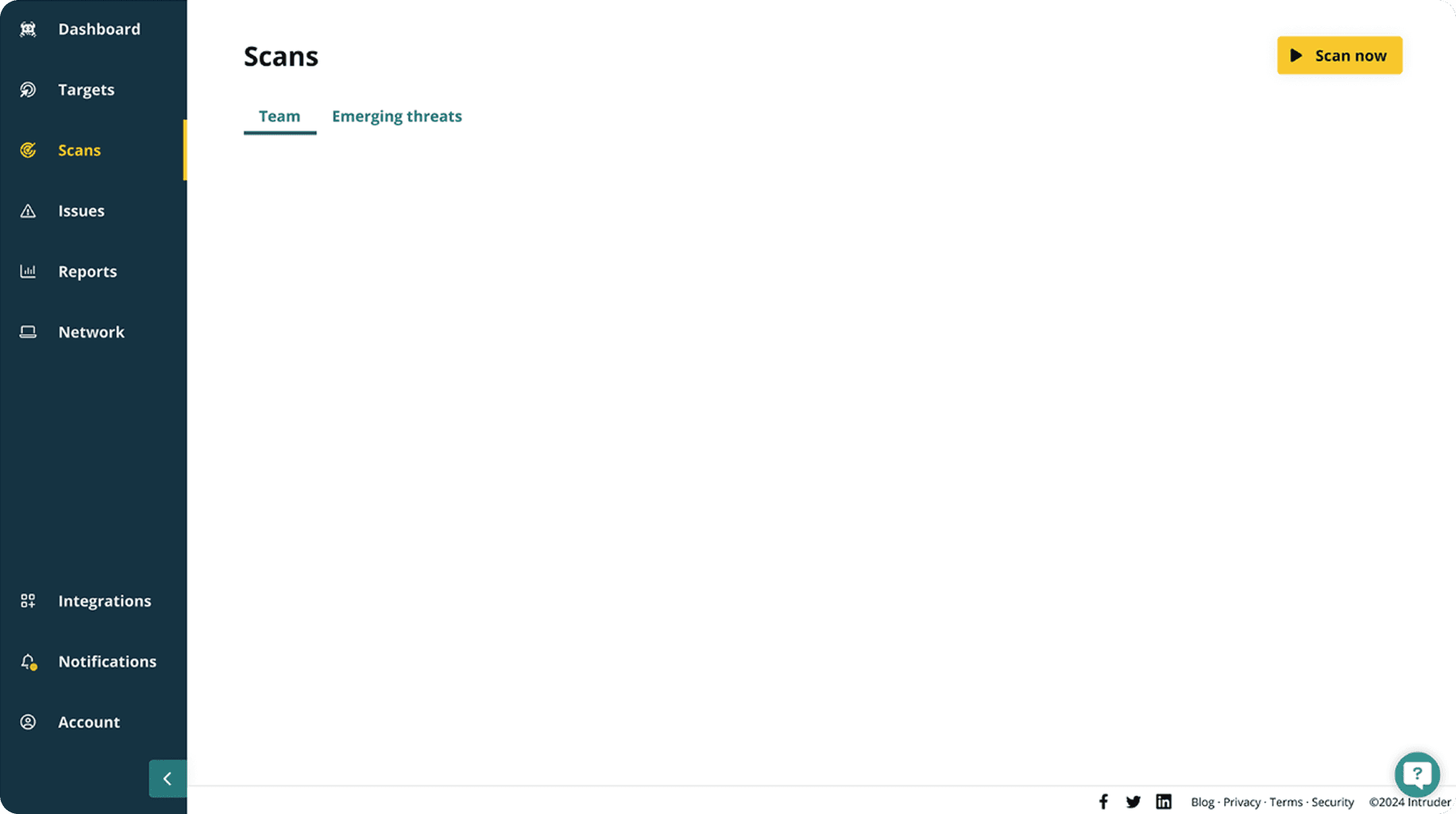
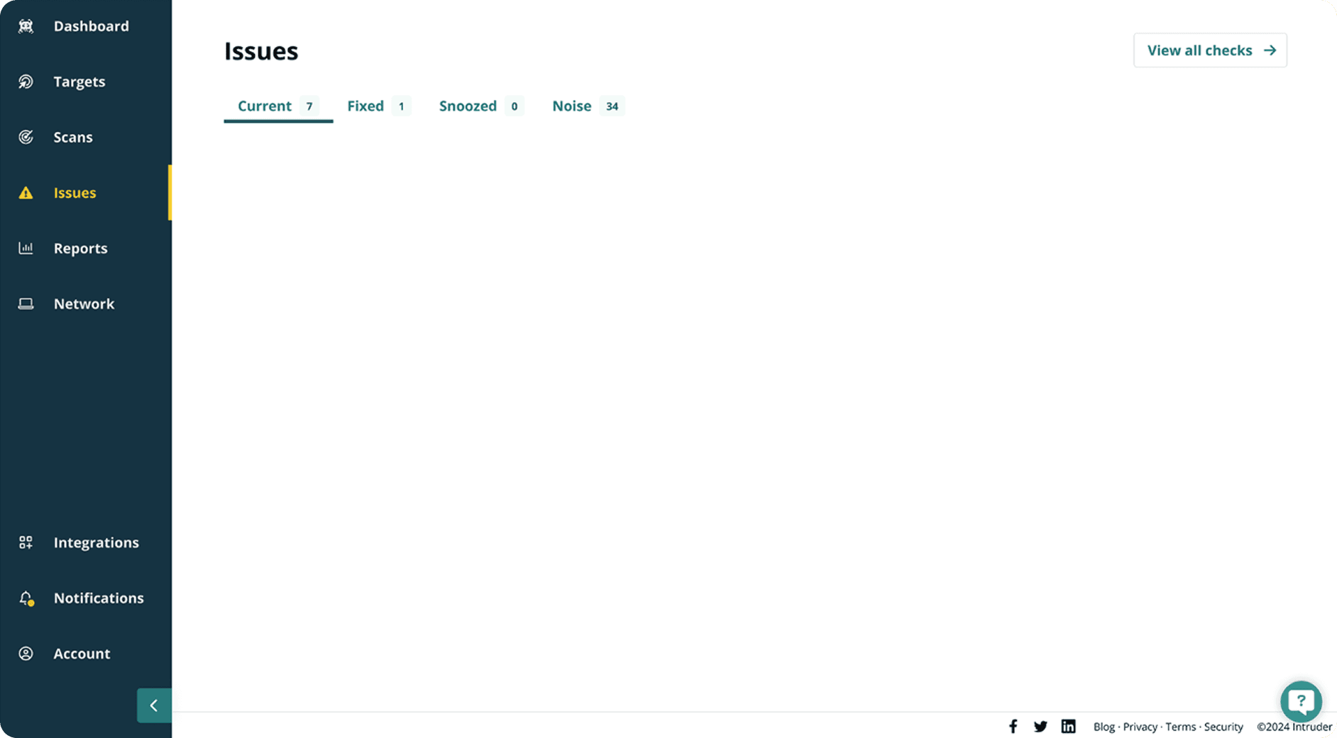
The competitor analysis revealed a clear pattern. The most successful platforms — Acunetix, Rapid7, and Detectify — all used left-top-top navigation with collapsible sidebars and industry-standard breadcrumbs. Meanwhile, platforms like Qualys that deviated from these patterns showed poor usability performance.
This wasn't just about following trends; it was about respecting Jakob's Law — users spend most of their time on other sites, so they prefer your site to work the same way.
Validating the problem
A/B usability testing to measure real impact
I designed rapid A/B tests comparing our current navigation against an industry-standard solution. Four users across different backgrounds attempted common tasks: navigating to scans, accessing reports, and finding their way back.
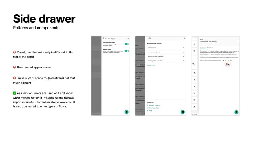
The results confirmed the problem. Users couldn't navigate backward — "I don't really see an easy way to go back." They struggled with our custom iconography — "I would probably need to take time and learn what each icon means." Small text and poor contrast created accessibility barriers. Most critically, users expressed anxiety and eroding trust — "I'm not sure you're testing me to find a way back which isn't possible. It isn't intuitive."
We weren't just creating usability problems — we were losing confidence at every click.
The solution
Designing for familiarity and confidence
With clear evidence of what wasn't working, I began designing the solution. The key insight: navigation should be invisible — users should focus on their cybersecurity tasks, not on learning our interface.
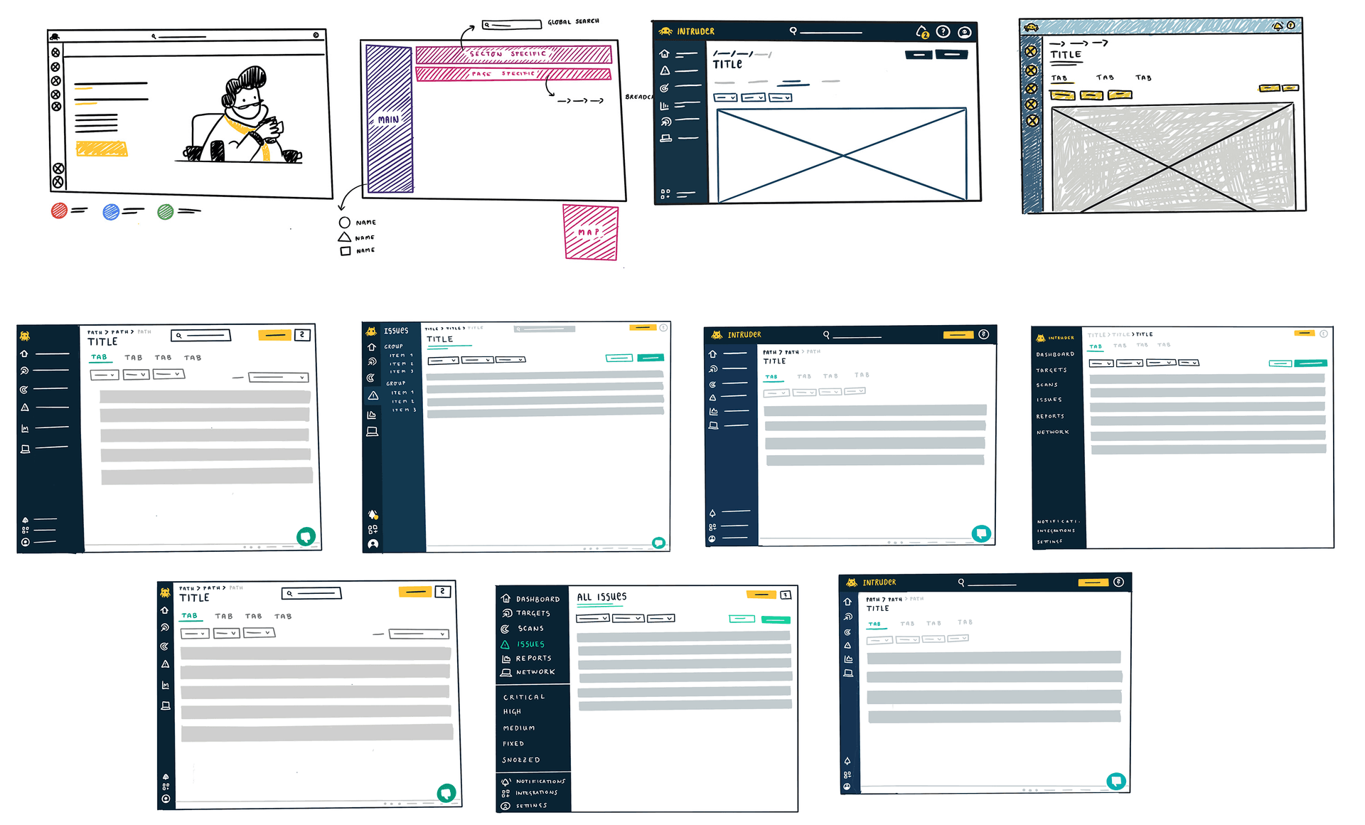
Three design principles guided every decision: navigate like your daily route to work (intuitive and predictable), feel brave and explore your options (confident even when exploring), and understand even in unfamiliar territory (universal patterns that feel secure).
I wireframed three approaches: a minimal update, a full industry-standard implementation, and a hybrid. Through stakeholder workshops and technical feasibility discussions, we aligned on the industry-standard left-top-top pattern with enhanced accessibility features.
From evidence to execution
Designing, building, and validating the new navigation
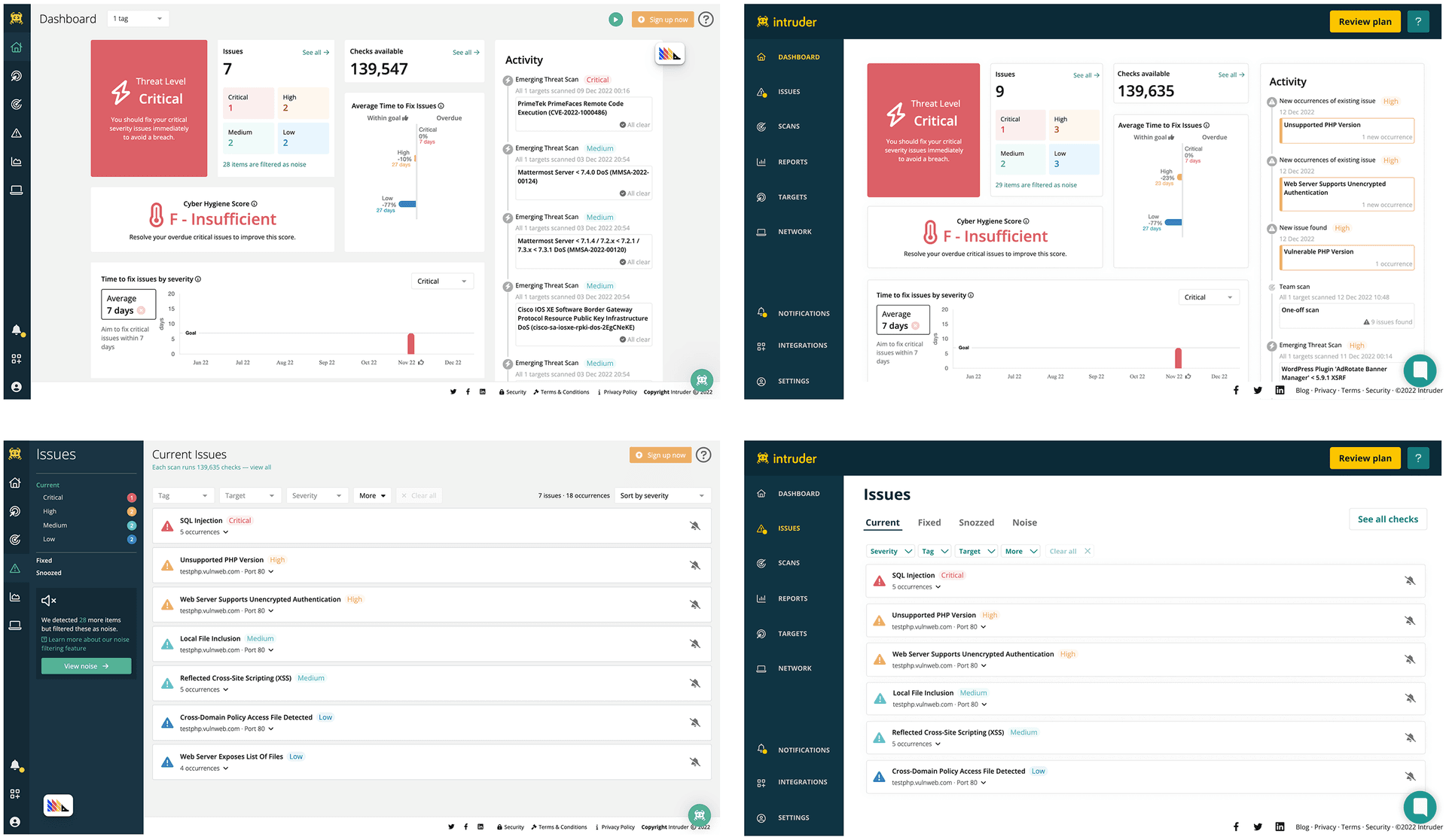
The high-fidelity designs addressed every pain point from research — breadcrumb arrows matching user expectations, text labels on all icons, increased text sizes, improved contrast ratios, and a collapsible sidebar. As design lead, I also coordinated with three development teams, establishing design tokens and creating documentation for consistent implementation.
A/B testing validated the solution. Users expressed confidence instead of anxiety: "You know exactly how to navigate. I feel like I have things in control." Tasks that were once frustrating became effortless: "In the first prototype it would take some longer, but now it's effortless."
Implementation
From design to development
I created pixel-perfect specifications, interactive prototypes demonstrating transitions and hover states, and conducted design reviews at each milestone. By establishing clear design tokens for spacing, colours, and typography, we ensured consistency across all 15+ unique page templates.
Results
Measuring success through user impact
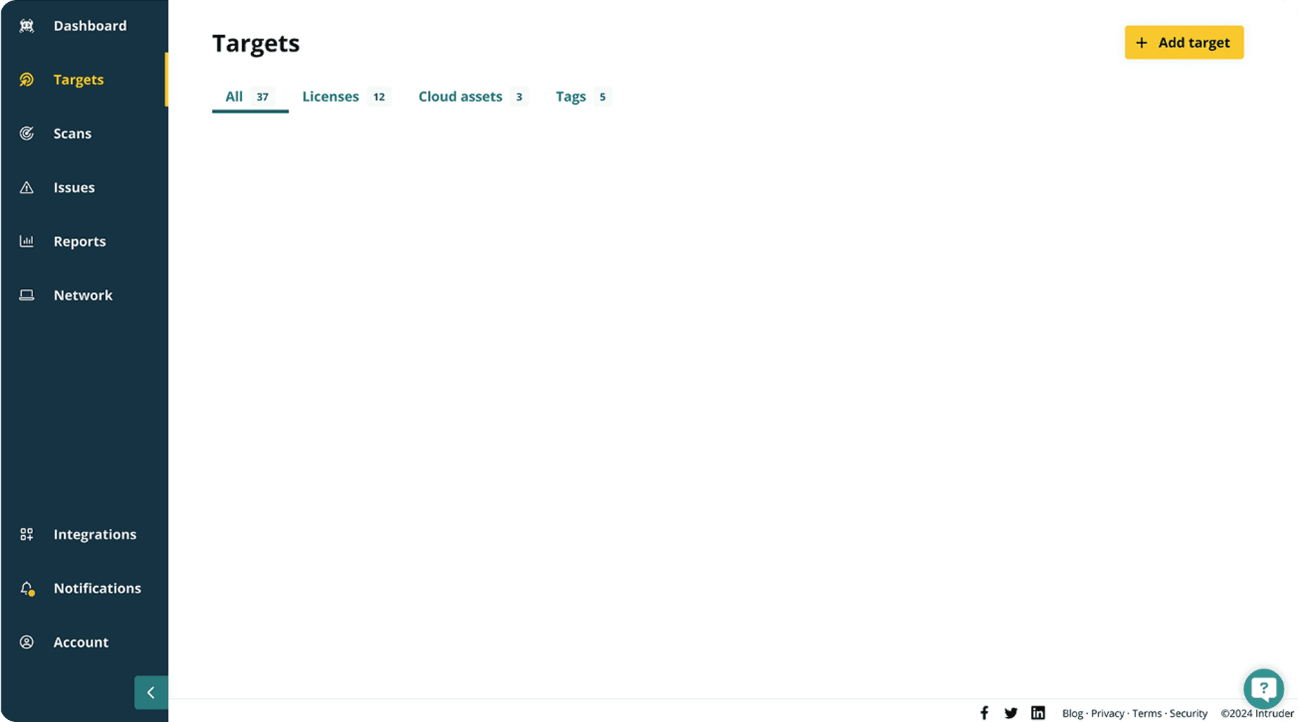
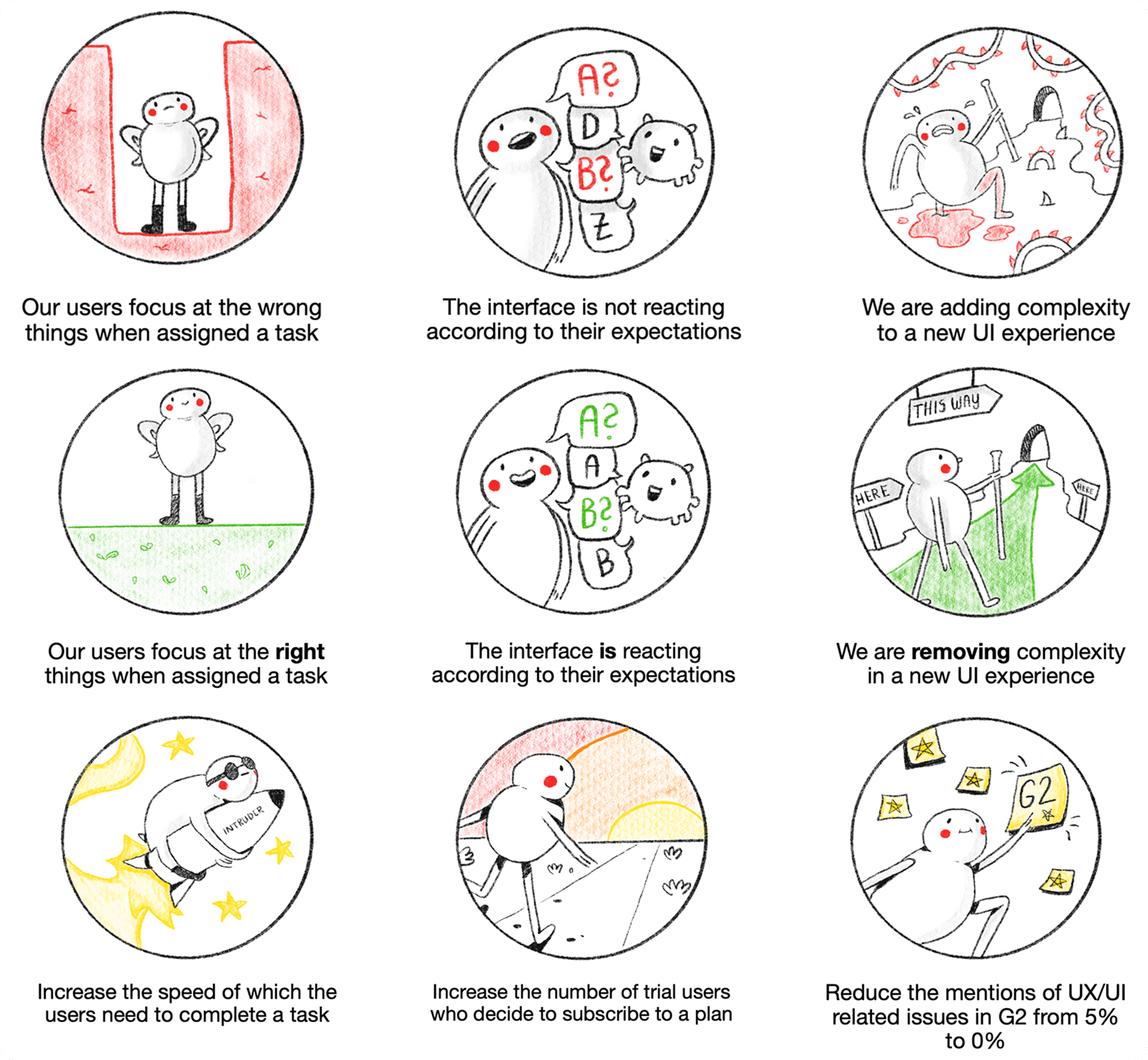
The impact was measurable across multiple dimensions: task completion speed increased by 40%, navigation-related support tickets dropped by 60%, and trial-to-paid conversion improved by 15%.
But the qualitative feedback told the real story. "It is easier to navigate!" became a common refrain. Users reported feeling more confident exploring the platform — "I know exactly if I want to go to the start or just one step back" — and accessibility improvements had broad reach: "Labels made it easy to navigate."
We'd achieved our three goals: users focused on the right elements, the interface matched their expectations, and we'd removed complexity from an already challenging cybersecurity workflow.
Reflection
The power of standard patterns
This project reinforced a fundamental UX principle: innovation should solve user problems, not create them. Our original navigation placed the burden of learning on users rather than meeting them where they were.
Navigation 2.0 built trust, reduced support burden, and created a foundation for future development. By aligning with industry standards, we freed users to focus on what matters most — protecting their digital infrastructure.
Most importantly, it showed that good design is often about restraint — following established patterns so users can accomplish their goals with confidence.
Read the full blog →