


Redesigning Personio's organisation chart: the feature that fueled a $6.3B valuation
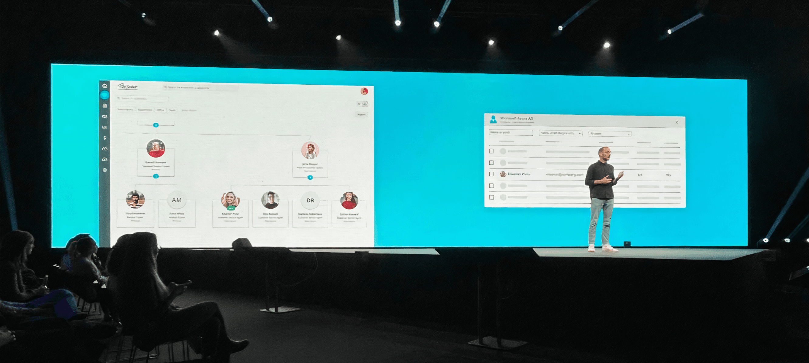
The org chart is the heartbeat of any HR platform — it's how companies see themselves. When I joined Personio's Employee Organisation team, the existing org chart had become a bottleneck: it couldn't scale with the ambitions of a product positioning itself as the modern digital core of European HR.
I was tasked with a full redesign — from research through to final UI. The stakes were high. In October 2021, Personio raised its Series E at a $6.3B valuation, and the org chart relaunch was a centerpiece of that story. It demonstrated what Personio's platform could become and opened the door to the People Workflow Automation category that would define the company's next chapter.
Discovery
A feature that screamed "legacy"
The existing org chart had surface-level problems — poor readability, limited scalability, and no attention to accessibility. But the usability issues ran deeper. The tool was so difficult to work with that most users bypassed it entirely, defaulting to Excel or Lucid Chart instead.
The redesign needed to bring the org chart up to the standard Personio was setting across the product: an experience that was not just functional, but genuinely delightful to use.
Business goals & team
Proving competitiveness where it mattered most
Personio's new strategic pillar, Strengthen Competitiveness in Mid-market, set the bar. We needed to prove the org chart could compete with dedicated tools and increase adoption among customers with 150+ employees. A secondary goal was reducing neutral and negative NPS comments related to usability.
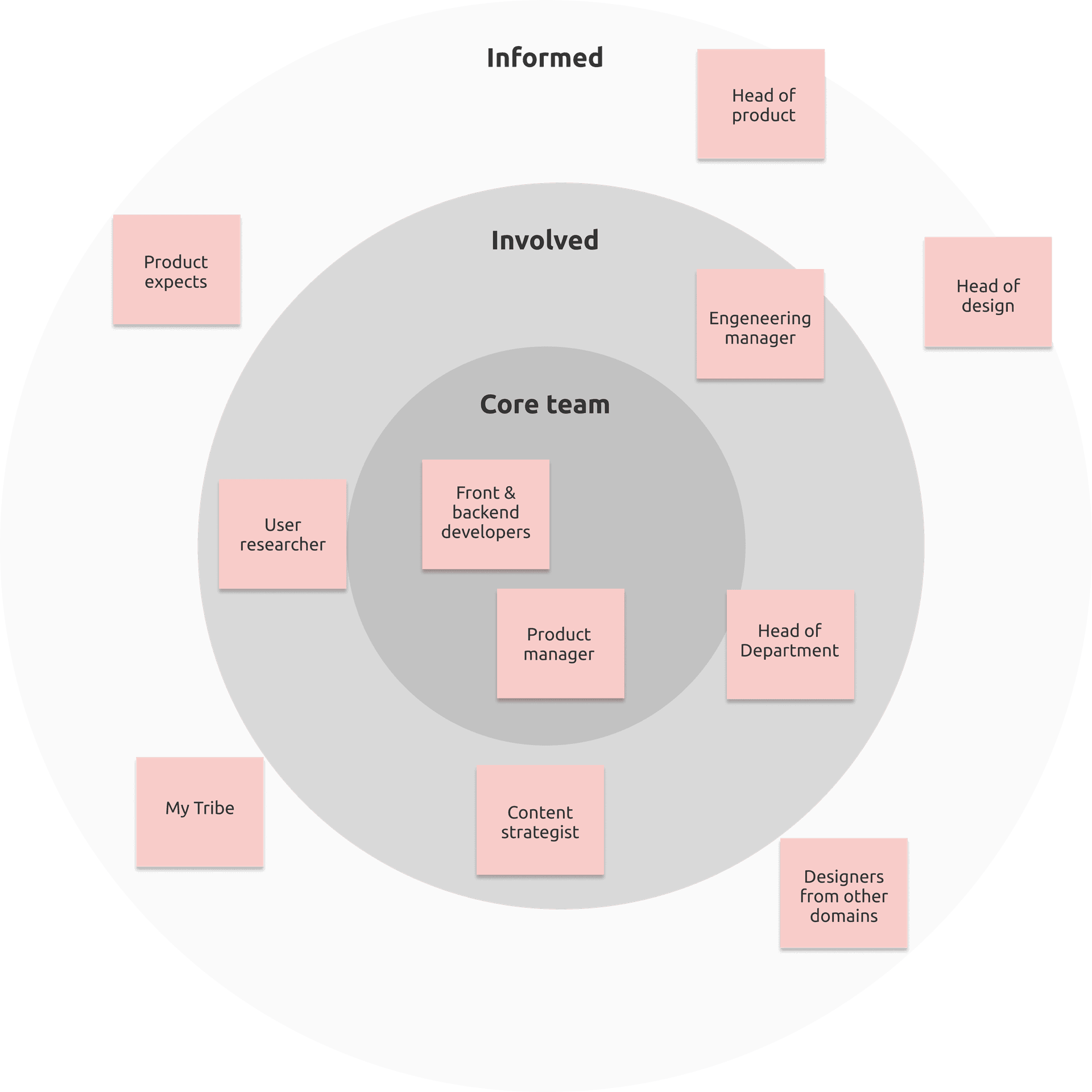
The project operated with three tiers of stakeholders. The core team (front & back-end developers, product manager, and myself) worked full-time on the redesign. An involved ring of user researcher, engineering manager, content strategist, heads of department and design, and cross-domain designers provided regular input alongside their other work. An informed outer ring including head of product, product experts, and the design system team stayed updated and gave feedback as needed.
Building a foundation of knowledge
Aligning the team before solving the problem
Before diving into problem areas, I needed to close knowledge gaps across the core team and stakeholders. A shared understanding of org chart structures would make future communication and decision-making significantly smoother. I did this through an in-depth knowledge presentation, a shared glossary, and a competitor analysis.
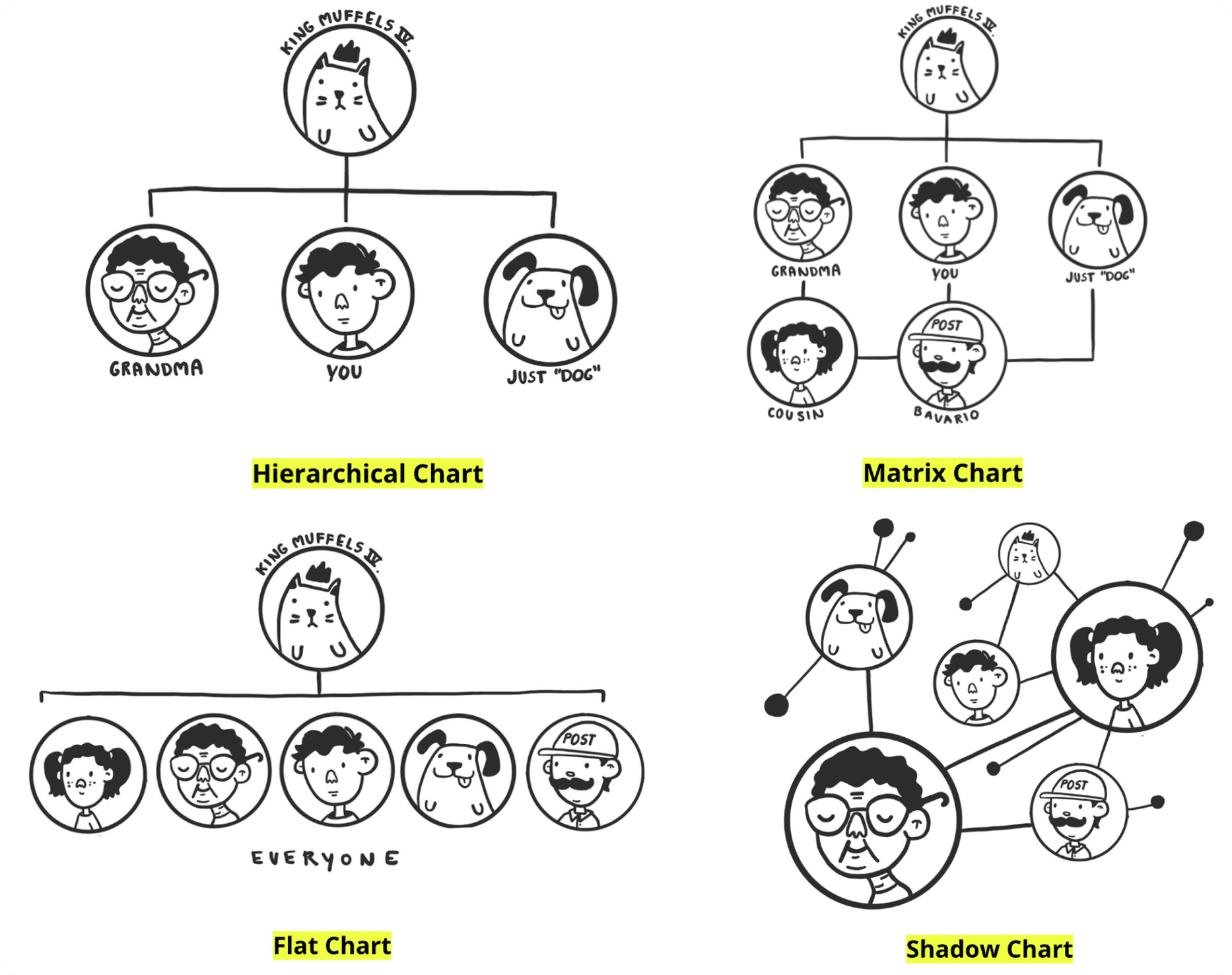
An org chart shows the roles within an organisation, how they relate to one another, and the authority structure between them. It can also visualize relationships across companies, departments, and teams.
Most HR tools default to a hierarchical chart, but the right structure depends on company size and complexity. Flat charts suit leaner organisations. Matrix charts handle more complex reporting lines. Our goal for Personio was to build a hierarchical chart with the flexibility to represent matrix structures and multi-layered organizations.
Competitor analysis
Where do we stand, and what does "good" look like?
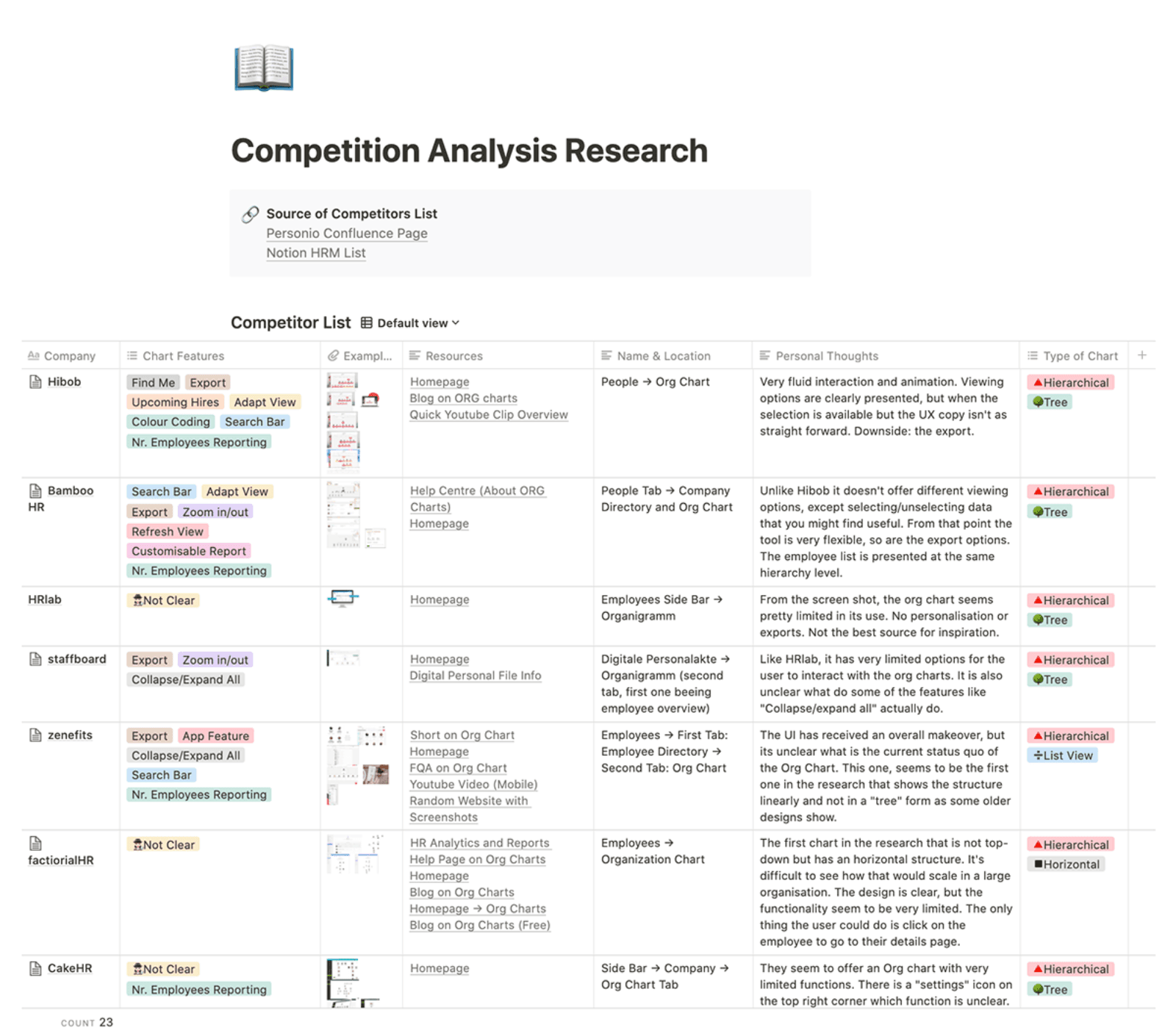
With a solid understanding of org chart fundamentals, I looked outward. What were competitors doing, and where did Personio sit in the competitive landscape? The analysis covered both direct HR competitors and standalone diagram tools to identify the features our customers would expect as a given, and the ones that could set us apart.
Clear patterns emerged. I categorised the findings into two groups:
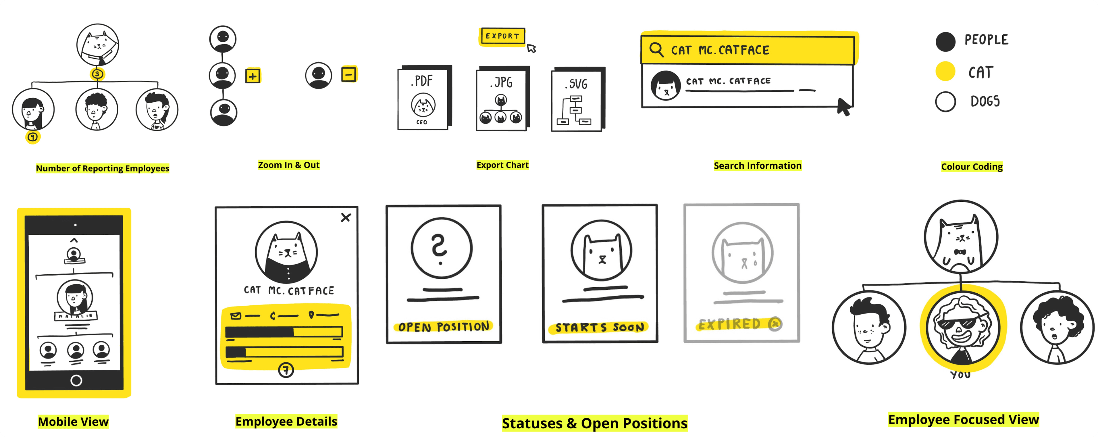
🐴 Common features:The "no-brainers" found across most competitor tools. These were table stakes we had to match.
🦄 Unicorn features: Rare across the market, but high-impact. These would be the differentiating factor for customers choosing an HR solution.
User research
Uncovering what the data and users were really telling us
I partnered with our user researcher, who owned NPS analysis and success metrics for Personio's OKRs. I owned current pain points: quantitative and qualitative research, plus usability testing with high-fidelity prototypes. We synced weekly, and I asked to be shadowed during sessions to sharpen my technique.
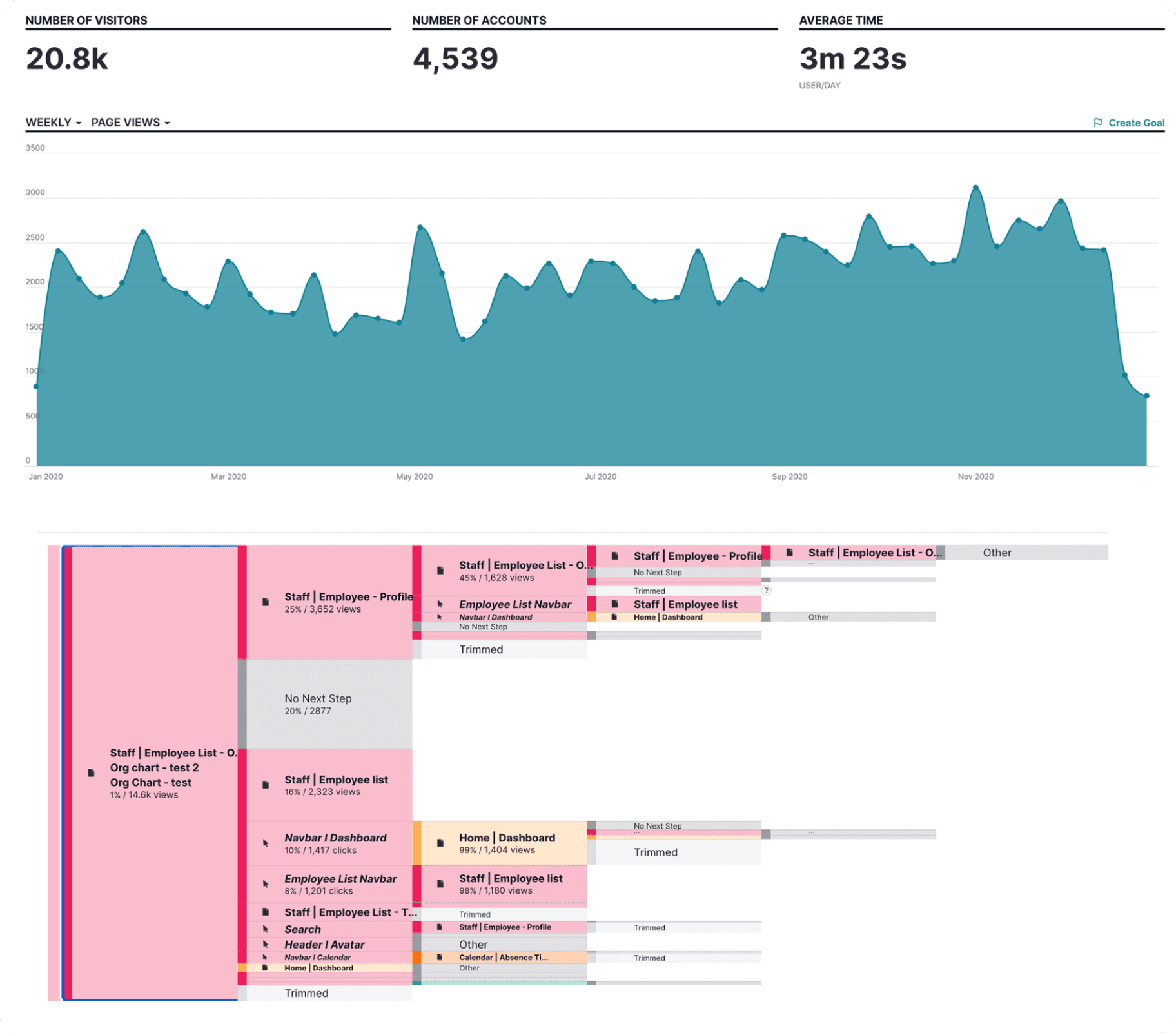
What the numbers revealed:Peak usage landed on Mondays and Tuesdays at the start of each month, tied to onboarding. Average session time was 3 minutes 23 seconds, mostly HR managers searching for information. Most striking: only 1% of users reached the org chart from the employee list, the only path available. An audit revealed why — most companies had turned the feature off entirely because Personio's "see everything or nothing" data model made NDA compliance impossible.
Three core problem areas:Information accuracy (what users saw didn't match reality), access rights (without granular visibility controls, HR managers disabled the feature), and data portability (org structure information was locked inside the tool with no way to export or reuse it).
Defining jobs to be done
From pain points to actionable user needs
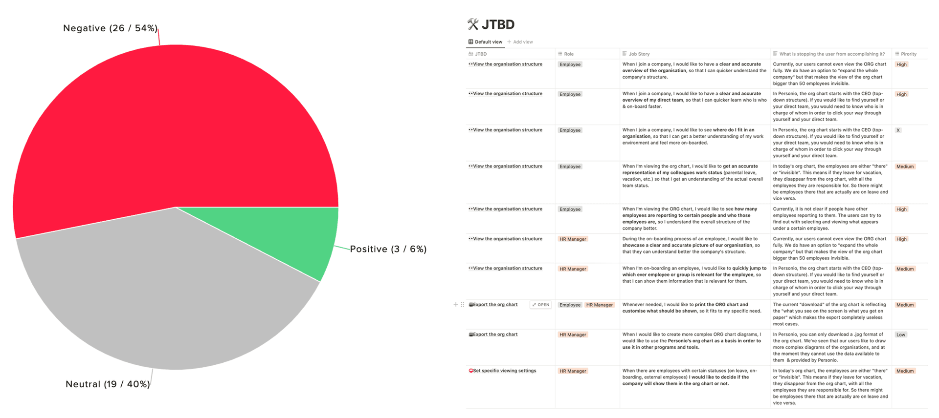
Based on the combined research, I defined Jobs To Be Done around Personio's two primary roles: Employees (any non-HR role) and HR Managers (including payroll and other roles handling sensitive data). NPS sentiment told the story clearly: 54% negative, 40% neutral, and only 6% positive.
Each job story mapped a user need to what was currently blocking it, alongside a priority level. This framework gave us a clear, prioritized backlog to design against.
Design
From sketches to concepts
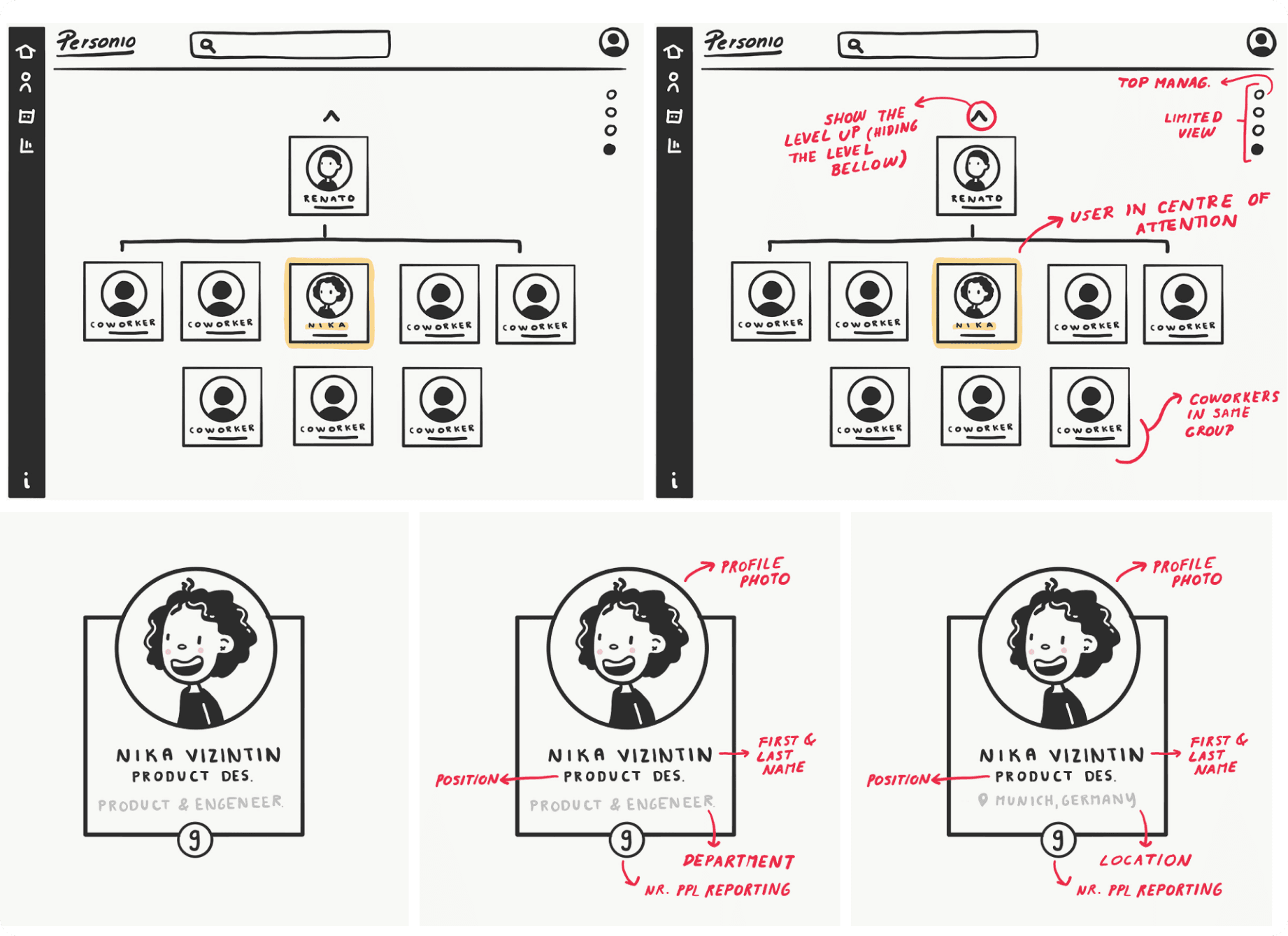
My creative process always begins on paper — sketching before opening Figma keeps me free to explore without digital constraints. Research showed users preferred a focused view centred on their own team, while C-level stakeholders wanted a top-down hierarchy.
I advocated for a hybrid approach: a focused, context-relevant view for employees alongside a traditional top-down view for HR managers. Leadership agreed, and this became the foundation for the wireframes — exploring both view types, the employee card, and how to link cards back to profiles.
Employee card component
The atomic unit of the org chart
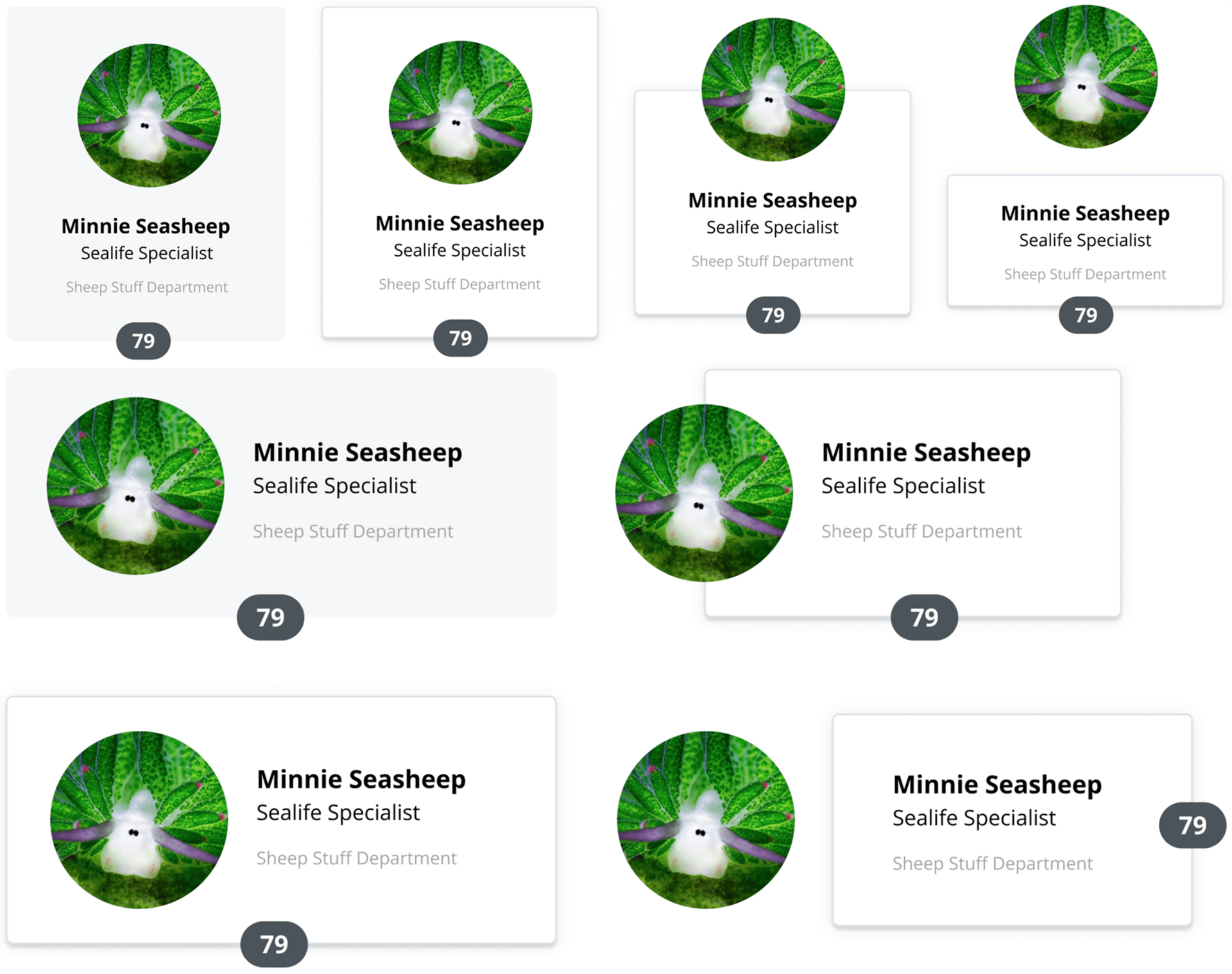
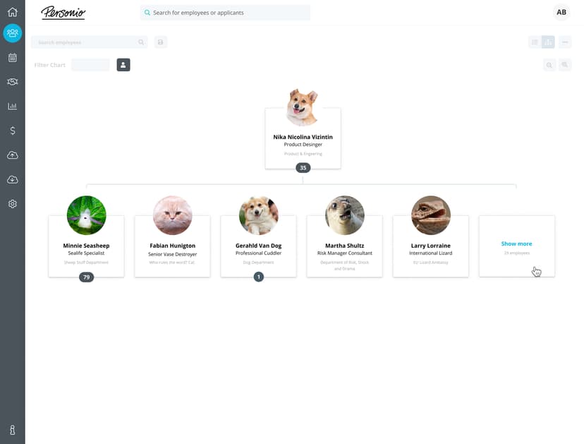
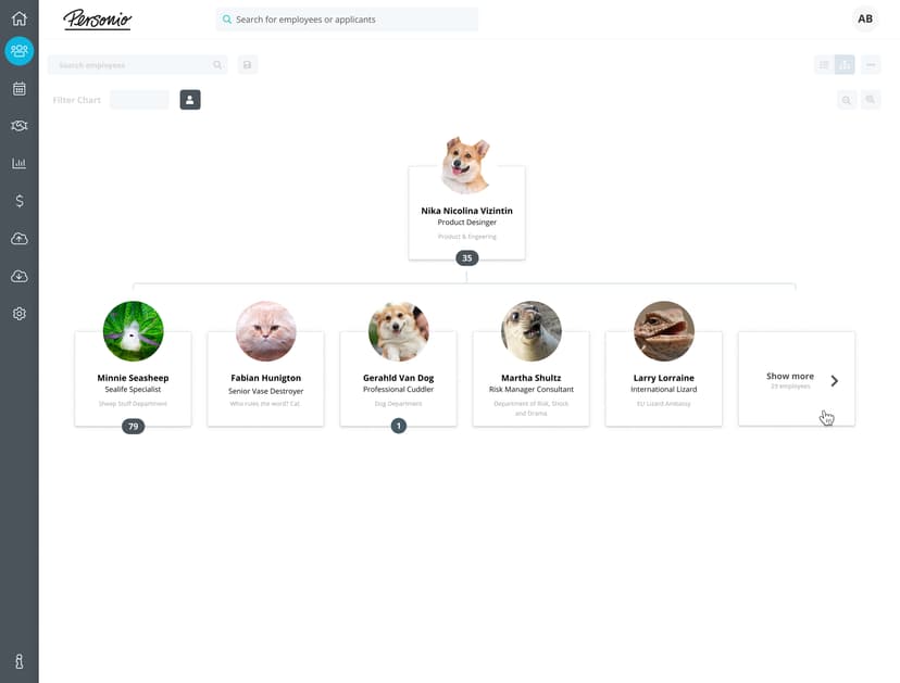
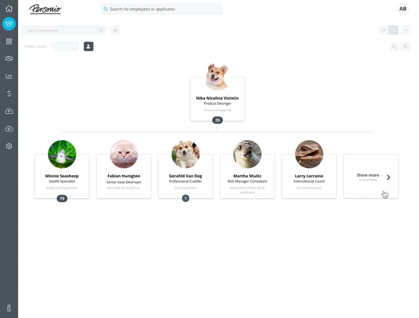
The high-fidelity card was built from Personio's Design System elements, combining existing patterns of user icons with other visual components across the product.
I explored both horizontal and vertical card layouts. Horizontal cards would have worked well with a horizontal tree hierarchy, but since we chose a central tree line, the vertically centered alignment tested better for readability in quick A/B comparisons.
Iterating toward the final design
Exploring layouts, refining with feedback, and shipping with confidence
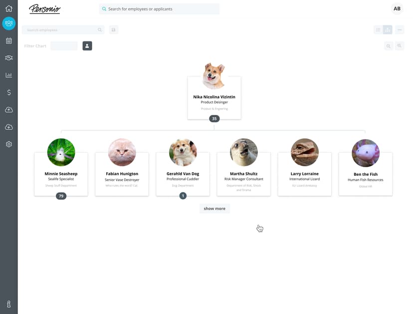
With the card component defined, I explored how different layouts and information hierarchies felt at full-page scale — focusing on navigation, team exploration, and intuitive orientation. I worked closely with the content strategist on terminology and information architecture throughout.
I ran three weekly rounds of usability tests, each with 7–9 participants. After every round I did rapid design iterations and presented findings to the core team. After three weeks, the designs shipped to beta customers for two more weeks of validation before going live.
Outcomes & the innovation factor
What three weeks of testing refined, and the feature that set us apart
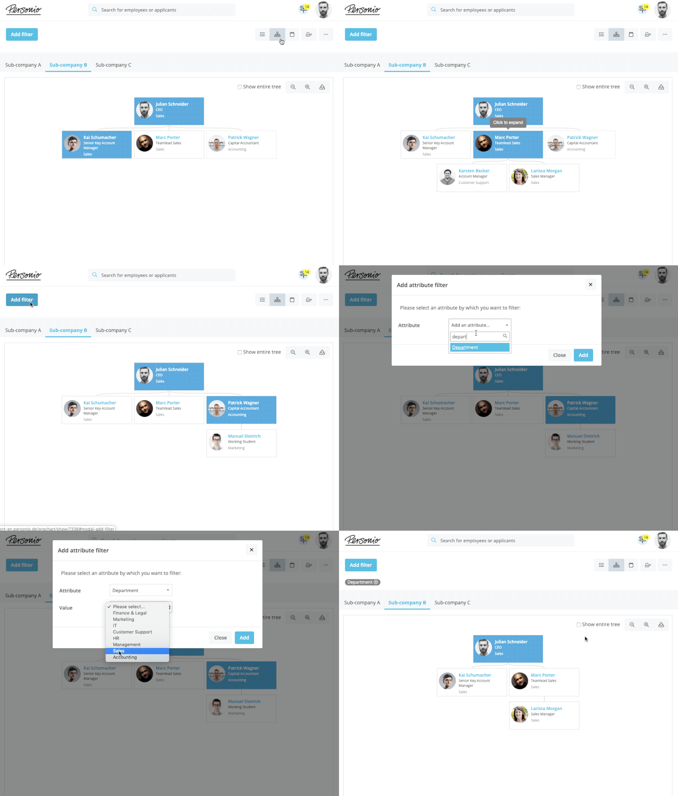
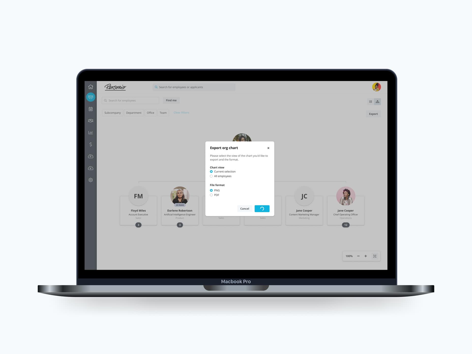
Each testing round sharpened the design. Call-to-actions like filters and export were refined until users understood them without hesitation. Mouse and keyboard navigation improved with every iteration, with developers supporting directly through StoryBook.
But even with these improvements, a core problem persisted: users couldn't orient themselves in a large hierarchy. They were seeing one small part of a big map with no sense of where they were in the whole structure.
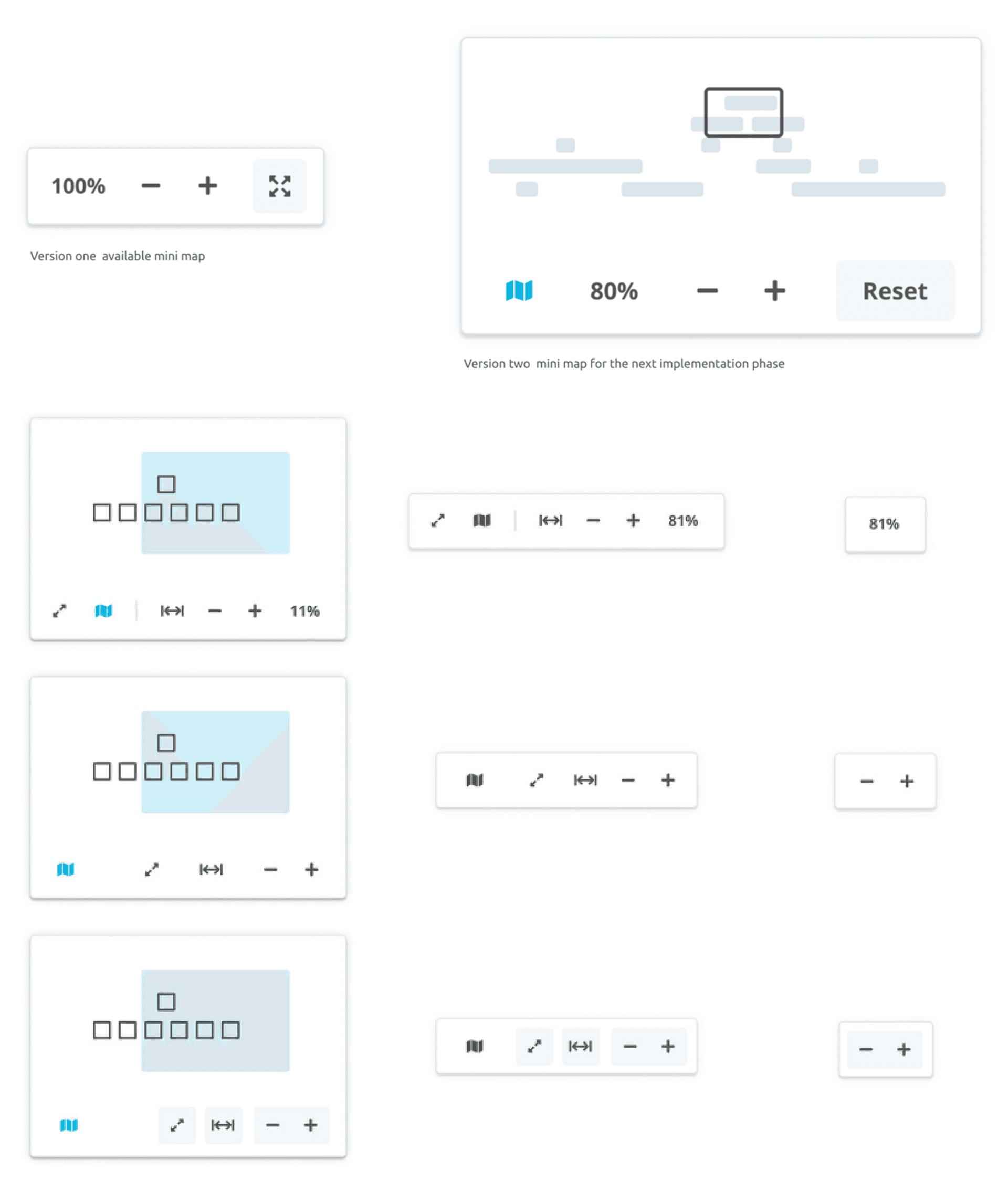
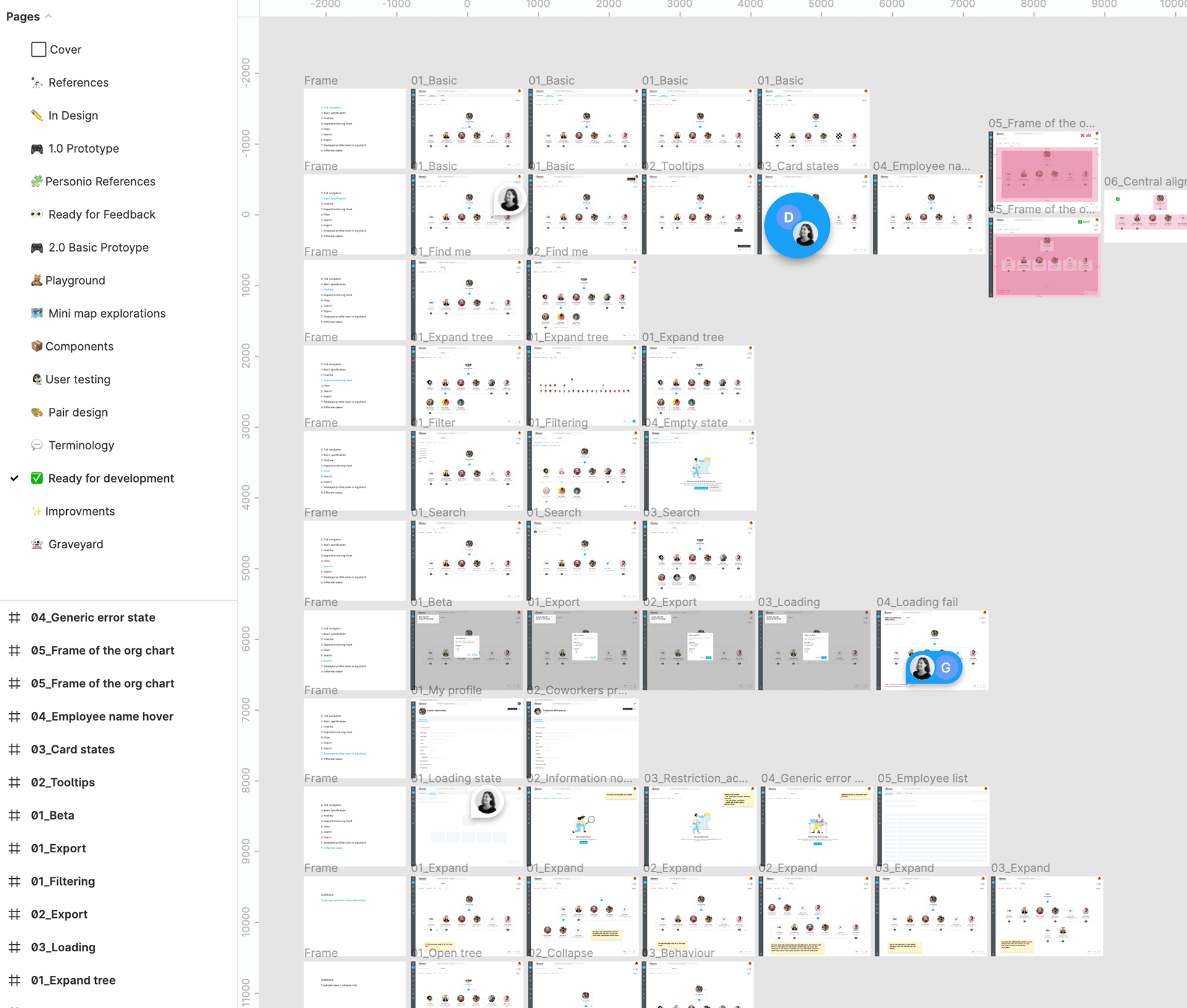
Taking inspiration from Miro, Mural, Google Maps, and Figma, I designed a mini-map: a birds-eye overview that lets users see their position within the full org chart and navigate to any part instantly. No HR competitor offered anything like it. The concept went through extensive exploration, from simple zoom controls to full spatial previews, before landing on two versions: a compact zoom control for the initial release, and a richer spatial mini-map planned for the next phase.
Final designs
Three iterations, one evolving vision
For handover, I created a key behaviour list alongside the designs and prototypes in Figma. The development team had everything they needed to build with confidence.
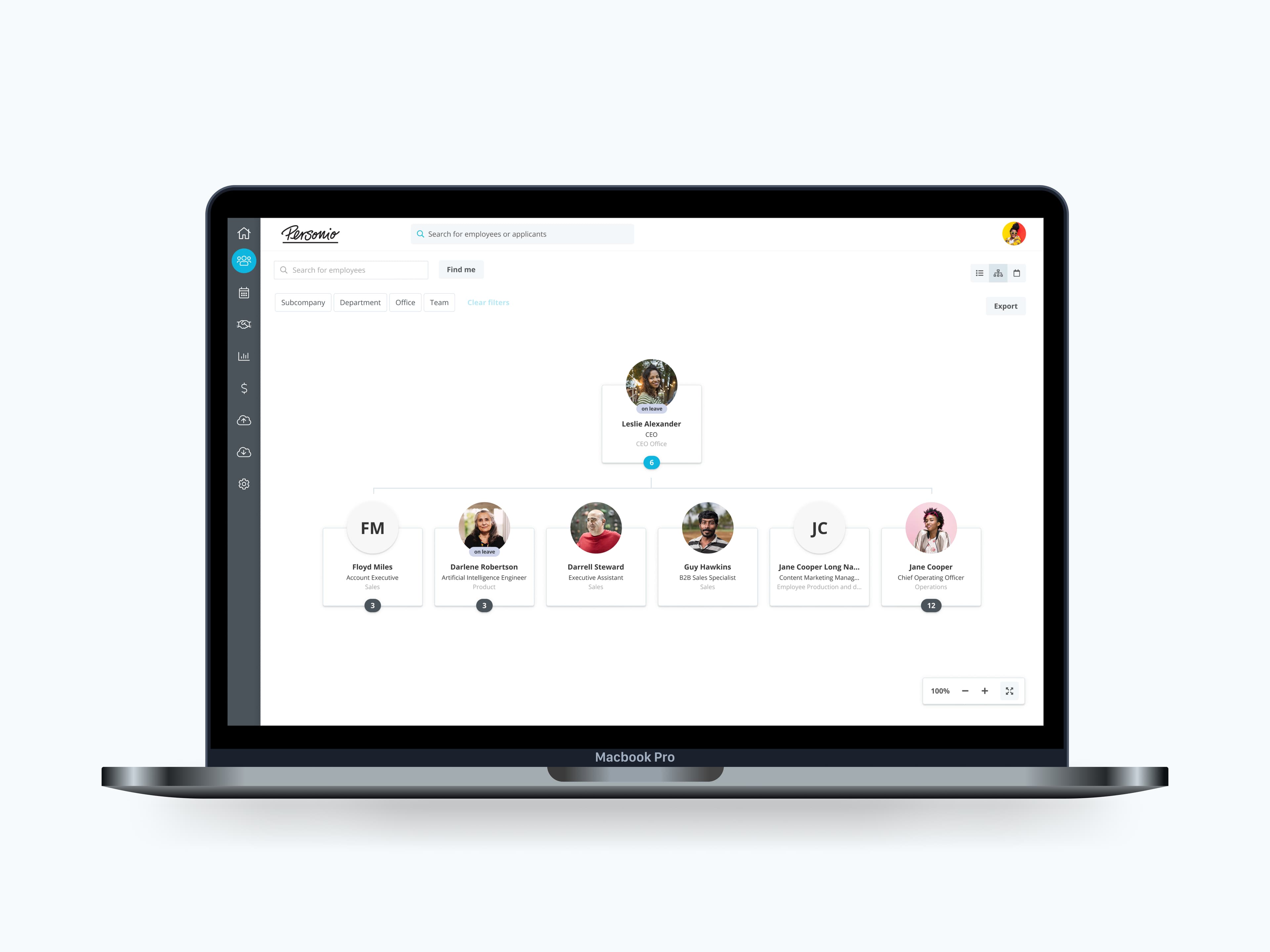
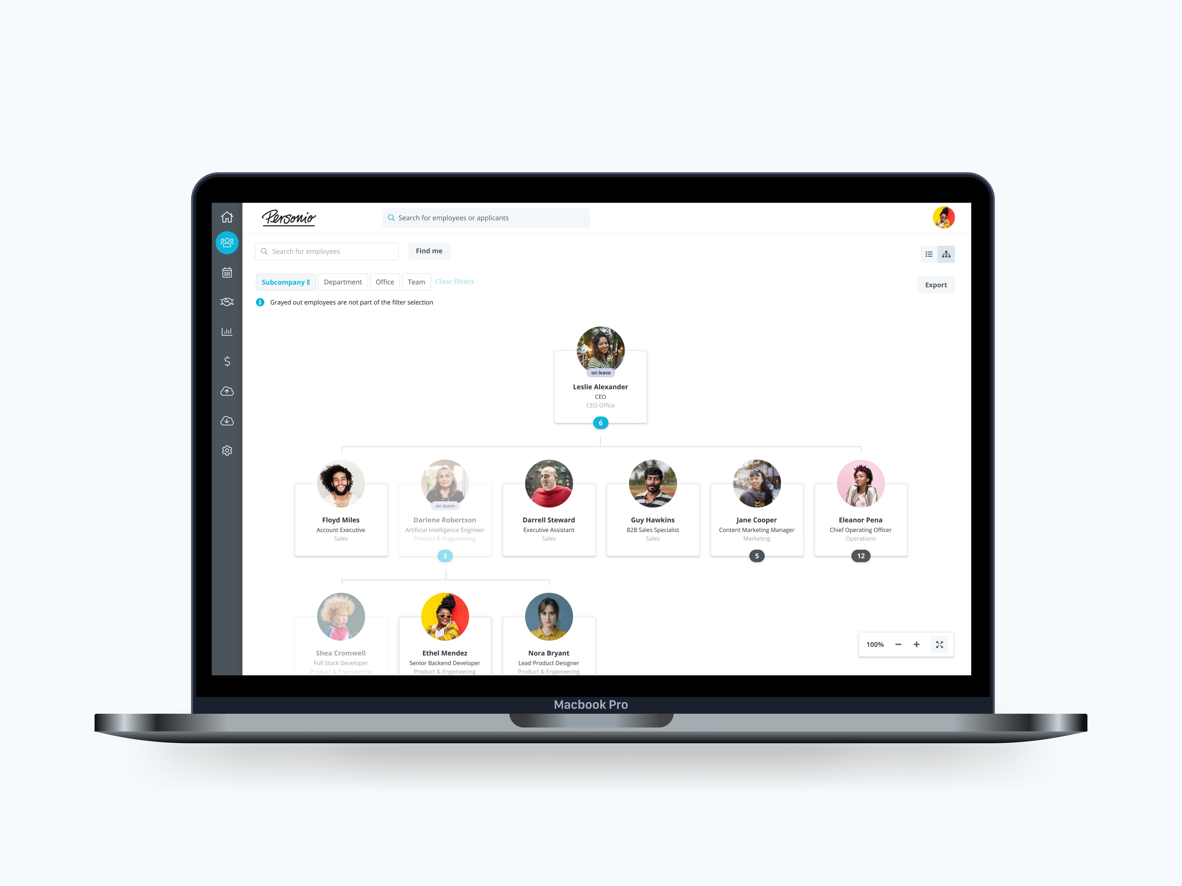
Three major iterations of the org chart were designed and user tested. While the overall look and feel remained consistent, each round significantly improved the user experience and addressed missing functionality.
There is always an "ideal" version of a design that exists within the limits of budget, development capability, and time. Our ideal org chart included every feature we wanted: a full spatial mini-map, multiple viewing options, saved views, and advanced export. But shipping everything at once wasn't realistic, so we planned the rollout in chunks, prioritizing the features that would create the most value first.
I like to design for the ideal solution while staying fully aware of the constraints. The ideal inspires people and can even shift a roadmap. Staying realistic keeps you fast and decisive about what to ship now versus next.
Impact
The numbers, and what they meant for the business
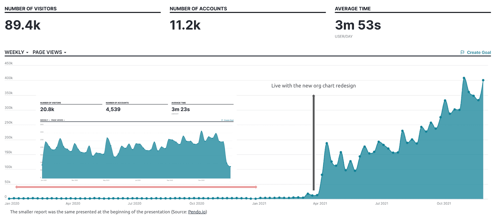
The results were immediate. As soon as the redesign went live, adoption skyrocketed. Page visitors jumped from a peak of 20k to over 400k. The number of active accounts nearly tripled, from 4k to 11.2k. Average time on page increased by 30 seconds, showing that users weren't just arriving, they were engaging.
But the biggest impact was on the business itself. In October 2021, Personio raised its Series E at a $6.3B valuation. The org chart redesign was at the center of the investor presentation, a proof point that Personio had built a modern digital core worthy of the HR mid-market. It signaled readiness to grow into the People Workflow Automation category and opened the doors for everything that followed.